Design Principles GCD60804

Marya Salah
0377224
Bachelor of Fashion Design Technology (Honours)
( Week 3 - Week 5 )
Table of Contents for Task 2 (Visual Analysis & Ideation):
- Introduction
- Selected Artwork/Design
- Visual Analysis
- Analysis of Design Elements
- Analysis of Design Principles
- Gestalt Principles in the Artwork
- Ideation Process
- Concept Development
- Final Design
- Feedbacks
Introduction
Selected Artwork/Design
Visual Analysis
What is Visual Analysis?
Visual analysis is a structured method of examining an artwork or design composition by evaluating its visual elements, design principles, and overall impact. This process helps us understand how different elements work together to convey a specific mood, message, or brand identity.
To thoroughly analyze the Vogue – May 2024 cover, we will break down our study into three essential phases:
1️⃣ Observation & Identification – Examining the core visual components.
2️⃣ Interpretation & Design Analysis – Evaluating how design principles are applied.
3️⃣ Impact & Effectiveness – Understanding how the composition influences the viewer.
🔍 Phase 1: Observation & Identification
This phase focuses on identifying the key visual elements that define the cover’s aesthetic and composition.
🎨 Color & Contrast
✔ The cover features a refined color palette, carefully selected to evoke sophistication and luxury.
✔ High contrast between the subject, text, and background ensures clarity and hierarchy.
✔ The dominant color harmonizes with supporting hues, guiding the viewer’s eye to essential areas.
🔤 Typography & Text Layout
✔ The Vogue logo is the most prominent element, reinforcing brand identity.
✔ A combination of serif and sans-serif fonts creates an elegant yet modern feel.
✔ Font hierarchy ensures the most crucial text stands out first.
🖼 Composition & Focal Point
✔ The main subject is positioned centrally, naturally attracting attention.
✔ Elements are arranged to maintain balance, using negative space effectively.
✔ The eye movement flows from the title to the face, then toward additional headlines.
📝 Phase 2: Interpretation & Design Analysis
Here, we assess how design principles are used to enhance the overall impact.
⚖ Balance & Harmony
✔ The composition maintains symmetry and proportion, ensuring aesthetic balance.
✔ The interplay of text, imagery, and background creates visual stability.
✨ Emphasis & Movement
✔ The model’s gaze and pose direct the viewer’s eye naturally.
✔ Bold typography and color placement create movement, leading the viewer across the page.
📐 Space & Alignment
✔ Negative space is strategically used to avoid clutter and enhance readability.
✔ The arrangement follows a grid structure, ensuring a clean, organized layout.
👁 Phase 3: Impact & Effectiveness
The final stage evaluates the cover’s effectiveness in conveying its intended message.
✔ The cover captures attention instantly, aligning with Vogue’s reputation for high fashion and elegance.
✔ A strong brand identity is reinforced through design consistency.
✔ The composition successfully communicates luxury, sophistication, and exclusivity to its target audience.
The Vogue May 2024 cover is a masterclass in design, where every element—color, typography, imagery, and composition—works in harmony to create a powerful visual statement. The strategic use of design principles ensures that the cover is aesthetically striking, emotionally engaging, and functionally effective in attracting its audience.
Analysis of Design Elements
🎨 Color – Contrast and Allure
What impressed me here was the clear contrast between the bold red of the dress and the calming green of the background. The red conveys a sense of strength and passion, while the green evokes calmness and balance. This contrast made the model appear as a blooming flower in nature, adding both drama and beauty.
➖ Lines – Simplicity and Fluidity
The lines in this design are soft and flowing, from the natural waves of the model’s hair to the circular lines of the dress that resembles a rose. These lines added a sense of delicacy and smoothness, making the whole scene appear cohesive and visually pleasing.
🔳 Shape & Form – Balance Between Nature and Fashion
The rose-shaped dress created a sense of merging fashion with natural elements. The form is well-balanced, with the model as the central focus while the natural background fills the scene without overpowering it, making the design feel like a blend of human and natural beauty.
🖐 Texture – An Intriguing Contrast Between Softness and Roughness
The smooth texture of the silky dress contrasts with the rough texture of the green leaves in the background. This contrast added a tactile depth to the design, making me feel as though I could touch both the softness of the fabric and the roughness of the leaves just by looking at the image.
📏 Space – A Balance Between Fullness and Emptiness
The use of space is very clever; the model and dress occupy the center of the cover while the background fills the rest of the space without feeling crowded. This balance ensured that the model remains the focal point, while the background retains its appeal.
Analysis of Design Principles
⚖ Contrast – The Most Striking Visual Element
The contrast between the red dress and the green background made the image vibrant and eye-catching. This contrast was the main visual attraction, drawing my gaze instantly to the model and her dress.
🌀 Balance – A Harmony Between Boldness and Calmness
Despite the boldness of the red dress, the calming background provided a perfect balance. The model appeared as a blooming flower, yet the entire scene conveyed tranquility and reflection, giving the cover a distinctive character.
🎯 Emphasis – Drawing Attention to the Model
The model’s pose, the color of the dress, and the placement of her hands all directed my eyes immediately to her face and dress. This design successfully guided the focus directly to the model while keeping other elements appealing.
♻ Repetition – Enhancing Visual Rhythm
The repetition of natural elements in the background added a visual rhythm that made the image more cohesive, as the surrounding leaves seemed to embrace the dress, creating a sense of continuity.
💫 Movement – How the Design Reacts to the Scene
Although the image is still, the rose-shaped dress and the model’s wavy hair added a sense of movement, as if the model was about to move or the wind was gently touching her hair and dress.
🔗 Unity – A Cohesive Visual Experience
The harmony between the red and green, the soft fabrics and rough nature, and the model and background made the cover feel like one integrated piece of art, where every element felt in place.
Gestalt Principles in the Artwork
🔲 Similarity – Connecting the Elements
The leaves in the background are similar in appearance, making them feel like a single supporting element that enhances the model without overshadowing her.
📍 Proximity – The Effect of Spacing on Design
The closeness between the dress and the leaves made the scene appear as though the dress was part of nature, not an external element.
⭕ Closure – Completing Shapes with the Eye
Even though the rose is not a real flower, the mind completes the shape, making it appear as an actual giant rose, adding an element of imagination to the image.
➰ Continuation – Guiding the Viewer’s Eye
The curved lines of the dress and the model’s arms naturally guided my eyes from the top to the bottom of the image, allowing me to explore all the design details effortlessly.
🌗 Figure/Ground – Interaction Between Foreground and Background
The model stood out clearly against the background, creating an intriguing interaction between the foreground and background, making the scene almost three-dimensional.
📌 Common Fate – A Sense of Movement in the Design
The leaves and the dress gave a feeling that all elements were moving together, as if a breeze was gently swaying the entire scene.
Ideation Process
Idea Generation:
2- Creating a fashion design inspired by the cover
Initially, I was considering two separate ideas:
1- Redesigning the cover of Vogue USA – May 2024 issue2- Creating a fashion design inspired by the cover
However, after further reflection, I realized that I could merge both ideas into one cohesive vision. Instead of simply redesigning the cover, I decided to extract key visual elements—such as colors, contrast, and classic elegance and translate them into a unique fashion design of my own creation, reflecting the essence of the cover in a fresh and innovative way.
Visual Direction:
Color Palette & Contrast: The original cover relies on strong contrast, which will be the foundation of my design. I will emphasize either black or red as the dominant color (I haven't decided yet), while the warm undertones of natural skin color will create balance, enhancing the overall visual harmony.
Exclusive Fashion Design – My Own Creation: I have designed an entirely original piece inspired by the cover but developed with my personal creative touch. The fashion design illustrated in the attached sketch is my unique work, integrating elements from the cover while maintaining a distinct and original artistic interpretation rather than a direct replication.
How the Idea Will Be Executed:
The final work will be either:
- A new magazine cover inspired by Vogue's aesthetic but incorporating my design elements.
- A fully realized fashion design that embodies the essence of the original cover but with a personal artistic direction.
Moodboard for sketch 1,2
Sources:https://se.pinterest,https://se.pinterest,https://se.pinterest,https://se.pinterest,https://se.pinterest
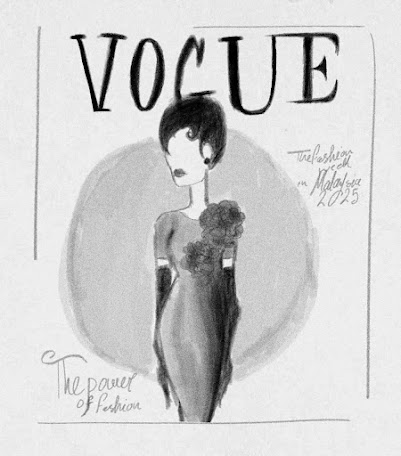
Sketch 1,2
(2 in 1)
Creating a fashion design and a cover at the same time, inspired by AMERICAN VOGUE MAY 2024 COVER
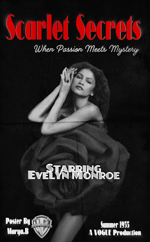
✅ Concept:
Transforming Vogue USA – May 2024 cover into a classic 1950s-style movie poster, maintaining the elegance of the original cover while adding cinematic elements that reflect the visual aesthetics of that era.
🔹 Design Details
🖋 Title & Text:
- Red will only be used in the typography, creating a striking contrast with the black-and-white theme.
- A vintage typeface from the 1950s movie posters will be used for the text.
- Placeholder credits will be added in a classic film poster style, such as:
- Starring: Evelyn Monroe
- Poster by: Marya.B
- Produced by: Vogue Studios
- Production company logo: Warner Bros. Pictures
🎨 Color Palette & Visual Style:
- The entire design will be in black, white and red tones.
- Dramatic shadows will be used to reflect the visual style of 1950s films.
Moodboard for sketch 3
Sources:https://se.pinterest,https://se.pinterest,https://se.pinterest,https://se.pinterest,https://se.pinterest
Concept Development
By developing these three ideas, I can explore different approaches to design, contrast, composition, and color usage in creative ways. Each concept reflects a different aspect of design, whether through reimagining the magazine cover, drawing inspiration for a fashion piece, or transforming the work into a cinematic experience. This process allows me to expand my understanding of design principles and apply them in various ways, enriching my skills and enhancing my artistic vision for the future.
Final Design
...


Comments
Post a Comment